
Searching:
0 results found Back
BackAdding Widgets
Axonize provides various types of widgets that can be added to a Dashboard, including the following:
- Devices – Creates a Thing counter to present all Things or connected Things for specific Thing groups/all Things.
- Last Readings – Creates a counter to show the last reading value sent from the selected Thing for a specified reading type.
- Real Time Readings – Creates a line chart for a reading type sent from the selected Thing.
- Aggregated Readings – Creates a list of readings for specific Device groups/all Device.
- Alarms – Creates a major, minor, critical or warning AlarmInstance counter for specific Device groups/all Devices.
- Alarms List – Creates an editable list of all Application Alarms, filtered according to the Alarm severity and time.
- Reports – Presents a table showing matching report results, based on the specified report query. Only one report can be displayed per widget.
- KPI – Performs aggregation on a Thing’s readings for a specific Thing.
- Gauge – The selected reading is shown in a classic gauge form. You can set the colors for the different zones on the gauge.
- Arch Gauge – The selected reading is shown in an arch gauge form. You can set the colors for the different zones on the gauge.
- Circle Gauge – The selected reading is shown in a circle gauge form. You can set the colors for the different zones on the gauge.
- Command – The widget supports sending a command to Devices that have a push-button type Command defined in the Product.
- Map – Creates a map showing Thing locations for specific Thing groups/all Things.
- Heatmap – Graphically represents readings data on a diagram, where the individual values are represented as colors. The heatmap provides a relative representation of the quantity of values of a certain reading.
- Chart – Creates a chart for one or more reading types sent from a selected Thing.
- Camera – Displays the video input/video stream for a Thing that is a camera.
- All Applications – Counts the number of Applications under the Tenant of a master Application
- Clock – Displays a digital or analog clock by time zone.
- Weather – Displays daily weather, humidity and wind speed by location.
- Properties and Settings – Displays the properties and settings for a Thing.
- Overall Readings – Displays the number of Things of a specific Product type and its Events (readings).
- Last widget chart reading- Shows the latest value from multiple readings on a chart.
- Space Utilization Widget – Aggregates data from occupancy sensors and a booking system, returning the percent of time the sensor is in one of four states.
Each widget has the following buttons:
- Delete Widget

- Edit Widget

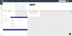
To add a widget to a Dashboard:
- In the left pane, click the Boards
 button.
 - Click the Settings
 button at the lower-right of the window:
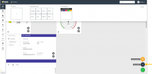
- Click the Add Widget
 button at the bottom right of the window:
The following displays –
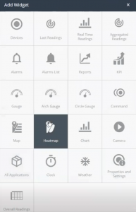
Each box in this window represents a type of widget that can be added to a Dashboard.
- Click the box corresponding to the type of widget that you want to add.
- Define the settings for the widget, and then click Done to save the settings. The settings that you specify vary, depending on the type of widget. For more details about the settings for each widget type, see Widget Settings.
Floor Plan
Displays the diagram of an area (zone, floor, room, etc.) and specific ‘things’ on top of it
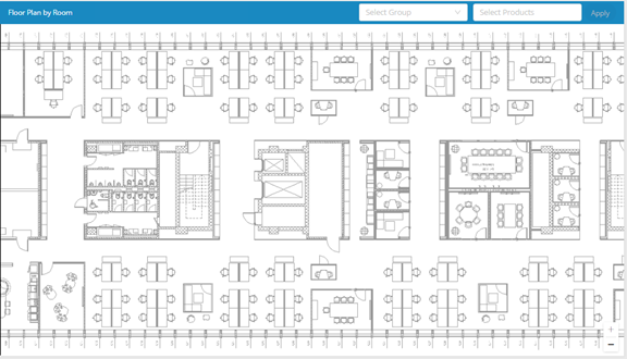
Select Group
Select the group’s diagram (room, floor, area, etc.)
Select Products
Select the products that will be shown on the diagram
Configuration
View Mode
-
- Application Diagram – Displays the diagram of the application
- Group Diagram – Displays the diagram of a specific group
- Reading: Specifies the Device reading to be included in the widget.
- Time Range: Specifies the time range for the data to display in the widget.
- Aggregation Method: Specifies the aggregation method to apply to the data (Average, Count, Min, Max) or
- Aggregation Times :Specifies the interval at which data is aggregated.
Widget Settings
Devices Widget
This widget presents all Devices (Things) or connected Devices (Things) for specific Device groups/all Devices.
Configure the following settings for the widget –
- Title – A free-text name for the widget, which displays at the top of the widget.
- Type – Specifies the type of Devices to include in the widget. Select either All, Connected Devices or Disconnected Devices.
- Groups – Specifies the group(s) to be included in the widget.
- Background Color – Select the background color to display for the widget.
- Add Custom Colors – Enables you to define a custom color to be used in the widget.
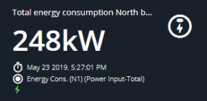
Last Readings Widget
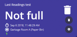
This widget shows the last reading value sent from the selected Device for a specified reading type. In addition, it shows the name of the Device, the Product icon (see page 102) and the timestamp sent by the Device in its payload for the reading.
The  icon indicates that the Device is connected.
Configure the following settings for the widget –

- Title – The same as described here.
- Device – The Device to be included in the widget.
- Reading – Specifies the Device reading to be included in the widget.
- Background Color – The same as described here.
- Add Custom Colors – The same as described here.
- Text Color – The same as described here.
Real Time Readings Widget
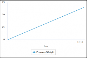

This widget shows a line chart for a reading type sent from the selected Device. The chart displays information since the day it was created. The time periods on the X-axis are set automatically based on the frequency at which the Device’s readings are sent. When multiple readings of different Device types are selected to show on a single Chart, additional axes are added with the relevant label and unit.
Configure the following settings for the widget –
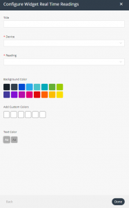
- Title – The same as described here.
- Device – The Device to be included in the widget.
- Reading – Specifies the Device reading to be included in the widget. These are events that were defined in the Product or events that Axonize accepts, even if they were not defined in the Product (for example, color changing, labels, icons and so on. The Reading dropdown list shows all the events that were defined in the Product Events tab, plus any other events that were not defined, but that were received from the Device.
- Background Color – The same as described here.
- Add Custom Colors – The same as described here.
- Text Color – The same as described here.
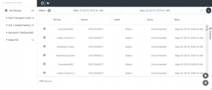
Aggregated Readings Widget
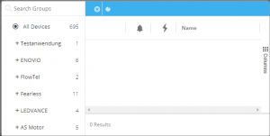
This widget creates a list of readings for specific Device groups/all Devices. The widget contains both a list of last readings and all readings. All information in the widget is read-only (not editable).
The widget shows the list of Devices in the left pane. The pane on the right presents two views. Click the relevant button to display the associated view –
- Last Readings View
 – This view shows the last readings for each Device. Each row represents a different Device. For each Device, the reading value is according to the last reading sent by that Device.
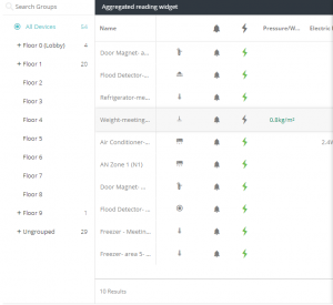
Click a Device row to view the properties and a chart for the associated reading.

- Readings View

This view shows the readings received from Devices. Each row represents a different reading, and specifies the Device from which it was received. A Device may appear in more than row. The most recent readings display at the top of the list.
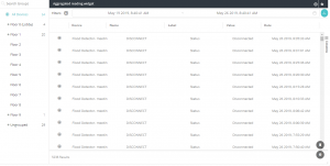
This view displays the following information for each Device reading –
-
- Icon – The icon representing the type of reading sent by the Device.
- Device – The name of the Device.
- Name – The name of the Event (reading) sent by the Device.
- Label – A user-defined name for the Event sent by the Device.
- Value – The value of the reading sent by the Device.
- Date – The date and time that the reading was sent by the Device.
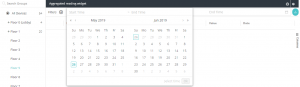
You can filter the view using the filters at the top of the pane. Click the  button to define a filter.

You can also filter by selecting a group in the tree in the left pane. Only one such filter can be applied at a time.
By default, the time range is from midnight of the previous day until the present time.
Click the  button to export to a PDF, Excel or CSV file.
Configure the following settings for the widget –
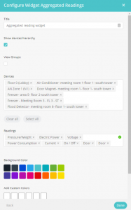
- Title – The same as described here.
- Show Devices Hierarchy – Check this checkbox to display the Device hierarchy in the left pane of the widget.
- View Groups – When checked, each row represents a different Group of Devices. The Group to which a Device belongs is defined when the Device is created.
- Devices – The Devices to be included in the widget.
- Readings – Specifies the Device readings to be included in the widget. These are events that were defined in the Product or events that Axonize accepts, even if they were not defined in the Product (for example, color changing, labels, icons and so on. The Readings dropdown list shows all the events that were defined in the Product Events tab, plus any other events that were not defined, but that were received from the Device.
- Background Color – The same as described here.
- Add Custom Colors – The same as described here.
- Text Color – The same as described here.
Alarms Widget
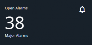
This widget shows a count of the number of Alarms of a given severity for specific Device groups/all Devices. You can also create a separate widget for all open Alarms.
Configure the following settings for the widget –
- Title – The same as described here.
- Severity – Specifies the severity of the Alarm (major, minor, critical or warning).
- Background Color – The same as described here.
- Add Custom Colors – The same as described here.
- Text Color – The same as described here.
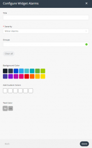
Alarms List Widget

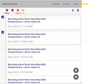
This widget shows an editable list of all the Alarms triggered by the Devices in the selected Group(s), filtered by alarm severity and time. Alarms that appear in the Alarm list are linked to Events. Pressing an Alarm in the list accesses the Event section with the relevant Alarm selected and its details visible. An Alarm displays in the list each time it is triggered. For example, if an Alarm is triggered 10 times, it appears 10 times in the Alarm list.
The dropdown list at the top right of the widget enables you to specify the timeframe for the Alarms.
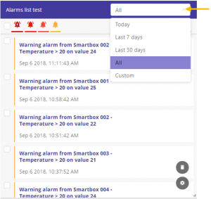
The bell icons in the widget enable you filter the Alarm list to specify the severity of the Alarms to display in the widget. A bell with a line beneath it indicates that the alarm severity is selected, which means that it will display in the widget. Click the Dismiss Alarm  button to display only dismissed alarms. Click the Snooze Alarm
  button to display only snoozed alarms.
Note ‒ Alarms cannot be deleted in the Alarm list.
When you select the checkbox for an Alarm in the list, additional option buttons appear at the top right of the widget. These buttons enable you to dismiss an alarm, snooze an alarm or clear an alarm, respectively.
Configure the following settings for the widget –

- Title – The same as described here.
- Groups – Group(s) of Products to display in the widget.
- Background Color – The same as described here.
- Add Custom Colors – The same as described here.
- Text Color – The same as described here.
Reports Widget
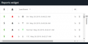
This widget presents a table showing matching report results, based on the specified report query. Only one report can be displayed per widget.
Configure the following settings for the widget –
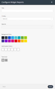
- Title – The same as described here.
- Entity – Specifies the entity to display in the widget, such as Devices, Products, Users and so on.
- Reports – Specifies the report to include in the widget. The dropdown menu lists all of the defined reports for the type of entity specified in the Entity field.
- Background Color – The same as described here.
- Add Custom Colors – The same as described here.
- Text Color – The same as described here.
KPI Widget
This widget enables you to perform aggregation on a Device’s readings for a specific Device.
Configure the following settings for the widget –

- Title – The same as described here.
- Device – Specifies the Device to display in the widget.
- Reading – Specifies the reading for the Device. The dropdown menu lists all of the readings for the Device specified in the Device field.

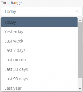
- Time Range – Specifies the time range for the data to display in the widget.
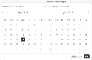
- Custom Time Range – Enables you to define a custom time range for the data to display in the widget.
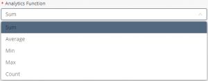
- Analytics Function – Specifies the function to apply to the data. For telemetric data, you can select from Sum, Average, Min, Max and Count. For state data, such as opening or closing a switch, you can only select Count.

- Background Color – The same as described here.
- Add Custom Colors – The same as described here.
- Text Color – The same as described here.
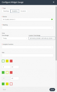
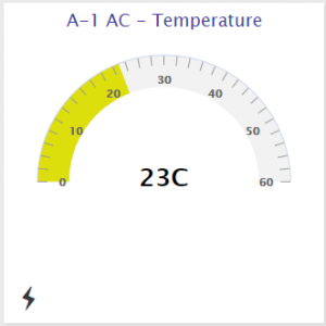
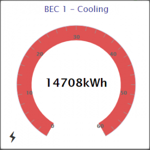
Gauge Widget
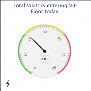
This widget shows a selected reading in a classic gauge form. You can set the colors for the different zones on the gauge.
Configure the following settings for the widget –
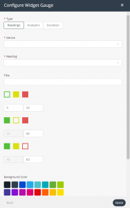
This widget has three tabs for defining the settings for the widget –
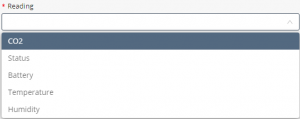
- Readings Tab – This tab defines the reading to the display in the widget. Define the following settings in this tab –
- Device – Specifies the Device whose reading to display in the widget.
- Reading – Select the reading to display in the widget.
-
- Title – The same as described here.
- Gauge Colors – Sets the color for each value range. You can set a range for Red, Green and Yellow. After you set a color for a range, its box displays a border in that color, and is not color-filled (for example,
 ). For example, the example below shows that the
0–20 range will display in green on the gauge, the range of 20–40 will display in yellow and the range of 40–60 will display in red.


- Analytics Tab – This tab specifies the functions to apply to the selected reading. You define the settings in this tab in the same way as those in the Readings tab.
The settings in this tab are the same as those in the Readings tab, with the following addition –
-
- Analytics Function – Specifies the function to apply to the reading data. For telemetric data, you can select from Sum, Average, Min, Max and Count. For state data, such as opening or closing a switch, you can only select Count.
-
- Duration Tab – This tab indicates the amount of time that the Device was in the selected state (in hours, minutes or seconds), as specified by the last reading received. For example, how long a door was open or closed.
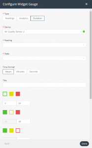
The settings in this tab are the same as those in the Readings tab, with the following additions –
-
-
- State – Specifies the name of the value. For example, Disconnected, Connected and so on. The dropdown menu shows all possible values of the reading selected in the Reading
- Time Format – Specifies whether to count the amount of time that the value was in the specified state in hours, minutes or seconds.
-
Arch Gauge Widget
This widget shows a selected reading in an arch gauge form. You can set the colors for the different zones on the gauge.
The settings for this widget are the same as those for the Gauge Widget.
Circle Gauge Widget
This widget shows a selected reading in a circular gauge form. You can set the colors for the different zones on the gauge.
The settings for this widget are the same as those for the Gauge Widget.
Command Widget
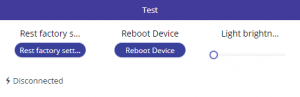
This widget enables you to toggle, use a slider or click a button to activate a command. For example, the sample Command widget above contains two buttons and one slider. A Command widget can contain up to three commands.
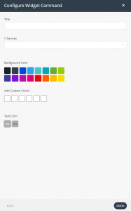
Configure the following settings for the widget –
- Title – The same as described here.
- Device – Specifies the Device(s) to display in the widget. The dropdown menu only contains Devices for which one or more commands have been defined in the Axonize API.
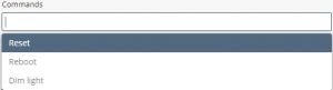
- Commands – Specifies the command(s) to include in the widget. The dropdown menu lists all of the commands for the Device specified in the Device field.
- Background Color – The same as described here.
- Add Custom Colors – The same as described here.
- Text Color – The same as described here.
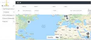
Maps Widget
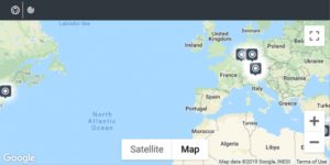
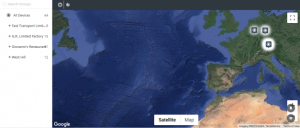
This widget creates a map showing Device locations for a specific Device, Device group or all Devices. The map is searchable and can be filtered by Alarms. You can toggle the map view to display either the last reading
() or all readings (). Click to display the last readings of the selected Device(s), along with the map.
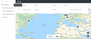
Click to display all readings, without the map.
The default map focus is set according to the default country code set for the Application. You can switch between Google’s satellite map and Google’s street view map.
Configure the following settings for the widget –

- Title – The same as described here.
- Show Devices Hierarchy – Check this checkbox to display the Device hierarchy in the left pane of the widget.
- Groups – Specifies the Device groups to display on the map. When the Show Devices Hierarchy checkbox is selected (see above), the list displays Device groups. You can drill down within a group to select a specific Device(s). You can only select a single group or a single Device.
- Background Color – The same as described here.
- Add Custom Colors – The same as described here.
- Text Color – The same as described here.
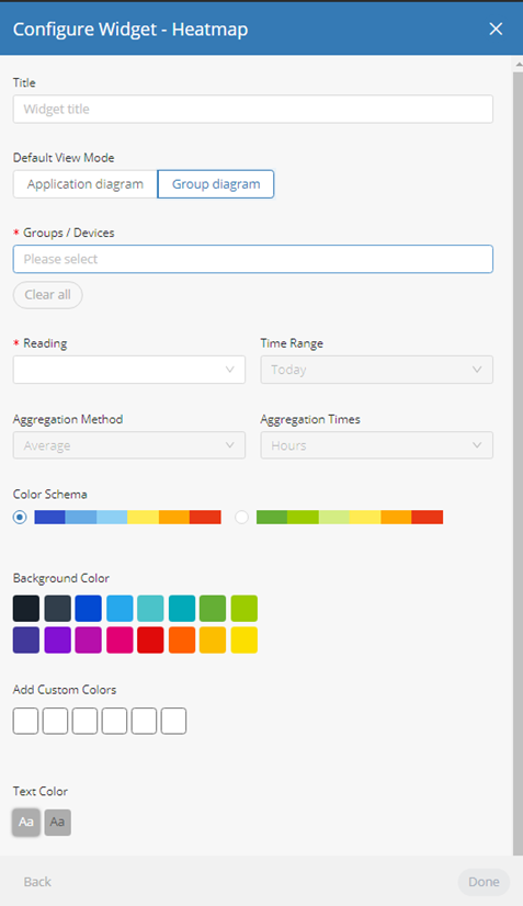
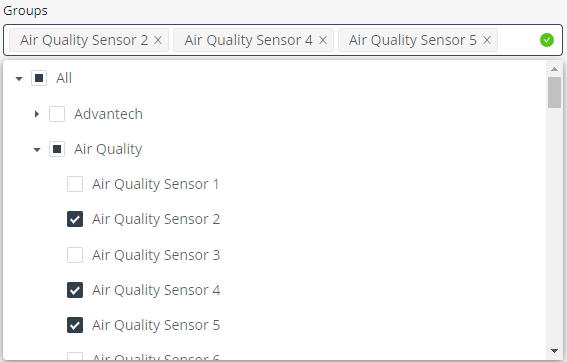
Heatmap Widget

This widget graphically represents readings data on a diagram, where the individual values are represented as colors. The heatmap provides a relative representation of the quantity of values of a certain reading. The diagram to display in the heatmap can be defined per application or per Group. The diagram itself can be a blueprint of a floor, a building, an area and so on, or another image of your choice. This widget can present data for Groups (of Devices) or one or more selected Devices. Devices that do not have relevant data are not shown in the heatmap. The lowest reading values are shown in blue and green on the heatmap.
Configure the following settings for the widget –

- Title – The same as described here.
- Default View Mode – Specifies the diagram to use for the heatmap. Click Application Diagram to display the diagram for the Application, or click Group Diagram to display the diagram for the Group.
Note – The Application diagram is defined in the Settings.
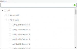
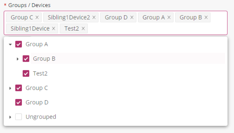
- Groups/Devices – Specifies the Groups or Devices(s) to display in the widget. It is possible to specify multiple devices or multiple groups. When using the “group diagram” option and multiple groups are selected, the diagram will be taken from the first group selected (In the attached screenshot, the diagram from Group C will be used). All further devices will then be set on that diagram.
- Reading – Specifies the reading for the Device(s). The dropdown menu lists all of the readings for the Device(s) specified in the Group/Devices field.
- Time Range – Specifies the time range for the data in the widget.
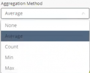
- Aggregation Method – Specifies the aggregation method to apply to the data (Average, Count, Min, Max) or
- Aggregation Times – Specifies the interval at which data is aggregated.
- Color Schema – Indicates whether cold temperatures are to be represented by blue or green.
- Background Color – The same as described here.
- Add Custom Colors – The same as described here.
- Text Color – The same as described here.
Chart Widget
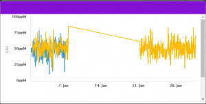
This widget creates a chart for one or more reading types sent from a selected Device. Choose the Chart type, value type (min, max, sum and so on) and the time gaps between periods on the X-axis. The Chart displays the information for the time period configured, which can be either a defined period (last week, last year) or specific dates.
Configure the following settings for the widget –

- Title – The same as described here.
- Device – Specifies the Device(s) to display in the widget.
- Chart Type – Specifies the type of chart to display in the widget.

- Aggregation Method – Specifies the aggregation method to apply to the data (Average, Count, Min, Max) or
- Aggregation Times – Specifies the interval at which data is aggregated.
- Readings – Specifies the reading(s) for the Device. The dropdown menu lists all of the readings for the Device specified in the Device field.
- Machine Learning – Enables you to forecast or predict the readings in the next time period based on algorithmic calculations. Different algorithms are used for the Forecast Linear and Forecast Quadratic For more details, see x.

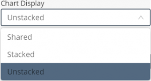
- Chart Display – Specifies the type of Chart to display. For more details, see x.
- Time Range – Specifies the time range for the data to display in the chart.
- Custom Time Range – Enables you to define a custom time range for the data to display in the chart.
- Background Color – The same as described here.
- Add Custom Colors – The same as described here.
- Text Color – The same as described here.
Camera Widget
This widget displays the video input/video stream for a Device that is a camera.
Note – To define a Device as a camera, see x.
Configure the following settings for the widget –

- Title – The same as described here.
- Device – Specifies the Device(s) to display in the widget. The dropdown menu only includes those Devices that are cameras.
- Background Color – The same as described here.
- Add Custom Colors – The same as described here.
- Text Color – The same as described here.
All Applications Widget
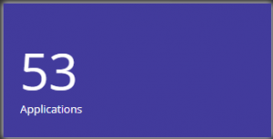
This widget displays the number of Applications under the Tenant of that master Application. This widget that is only available for master Applications.
Configure the following settings for the widget –
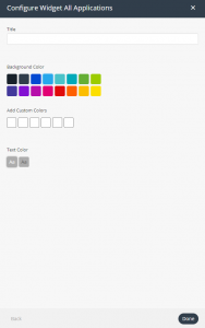
- Title – The same as described here.
- Background Color – The same as described here.
- Add Custom Colors – The same as described here.
- Text Color – The same as described here.
Clock Widget
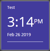

This widget creates a digital or analog clock by timezone.
Configure the following settings for the widget –
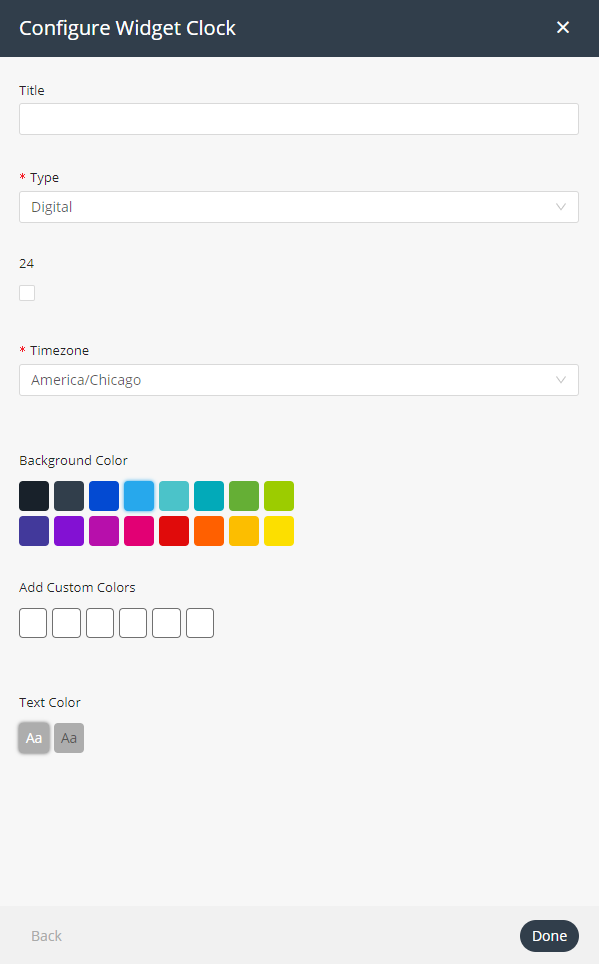
- Title – The same as described here.
- Type – Specifies the type of clock – Analog or Digital.
- 24 – When this checkbox is checked, indicates that the clock is a
24-hour clock instead of a 12-hour clock. This setting only applies when you specify Digital in the Type field. - Timezone – Specifies the timezone for the widget.
- Background Color – The same as described here.
- Add Custom Colors – The same as described here.
- Text Color – The same as described here.
Weather Widget

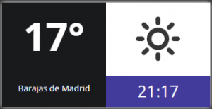
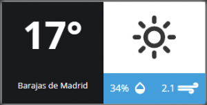
This widget displays the daily weather, humidity and wind speed by location.
Configure the following settings for the widget –
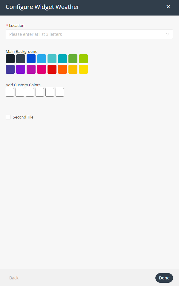
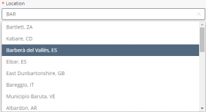
- Location – Specifies the location for the widget.
- Main Background – Select the background color (main pane) to display for the widget.
- Add Custom Colors – The same as described here.
- Second Tile – When this checkbox is checked, the widget displays two panes instead of one. You can define the background color for each pane separately.
- Clock – Click this button for the widget to display the time.

- Detailed Weather – Click this button for the widget to display detailed weather information.
- Timezone – Specifies the timezone for the widget.
- Second Tile Background Color – When the Second Tile checkbox is checked, specify the background color for the widget’s second (right) pane.
- Add Custom Colors – When the Second Tile checkbox is checked specify the custom color to use for the widget’s second (right) pane here.
Properties and Settings Widget
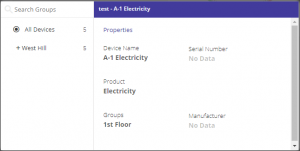
This widget displays the properties and settings for a Device. All data displayed in the widget is read-only. Properties are static values on a Device. Settings are synchronized between the digital device in Axonize and the physical device itself, and affect the device itself (like a command).
When specifying more than one Device, the widget displays a tree structure in the left pane. To view the properties and settings for a specific Device, simply select it in the tree in the left pane.

Configure the following settings for the widget:
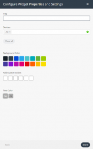
- Title – The same as described here.
- Devices – Specifies the Device(s) to display in the widget.
- Background Color – The same as described here.
- Add Custom Colors – The same as described here.
- Text Color – The same as described here.
Overall Readings Widget
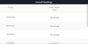
This widget displays the number of Devices of a specific Product type and its Events (readings).
Configure the following settings for the widget:
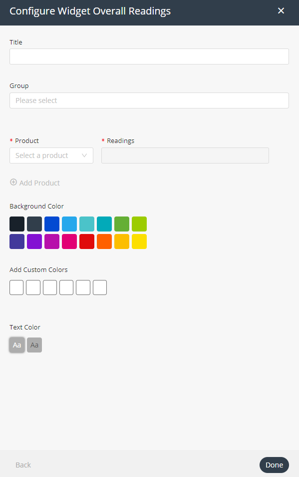
- Group – Specify the Group of Products to display in the widget.
- Product – Select the Product to include in the widget in the dropdown menu.
- Readings – Specify the Event whose readings you want to display in the widget.
*Note ‒ An Event must already exist to be specified here.
- [Optional] Add Product – Click the Add Product button to add another Product to the widget. You must also specify the Event whose readings you want to report for this Product in the adjacent Readings. You can add an unlimited number of Products to the widget.
- Background Color – The same as described here.
- Add Custom Colors – The same as described here.
- Text Color – The same as described here.
Last Reading Chart Widget
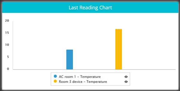
This widget shows the latest value from multiple readings on a chart.
Configure the following settings for the widget:
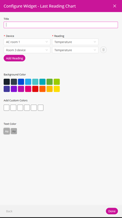
Title: The title of the widget
Device: Choose a device
Reading: choose a numeric reading from that device
Add device: add as many devices as you need
Background Color: The same as described here
Add Custom Colors: The same as described here
Text Color: The same as described here
Space Utilization Widget

This widget aggregates data from occupancy sensors and a booking system, returning the percent of time the sensor is in one of four states:
- Space is booked and occupied
- Space is booked and unoccupied
- Space is unbooked and unoccupied
- Space is unbooked and occupied
Configure the following settings for the widget:

- Title – The same as described here.
- Space – Choose a space which has a calendar defined, this can be a device or a digital twin.
- Time Range – Choose the time range to aggregate, options are preset but dynamic.
- Aggregation Times – Choose the aggregation bucket to roll up to, these options change based on the time range selected.
- Timezone – The timezone where the space is
- Readings – Which of the 4 states should be displayed
- Work Days – Which days of the weeks should be included in the aggregation, this is relevant as usually the utilization over weekend is just white noise
- Start Time/End Time – Which hours of the day should be included in the aggregation, this is relevant as usually the utilization at night is not as relevant
- Background Color – The same as described here.
- Add Custom Colors – The same as described here.
- Text Color – The same as described here.